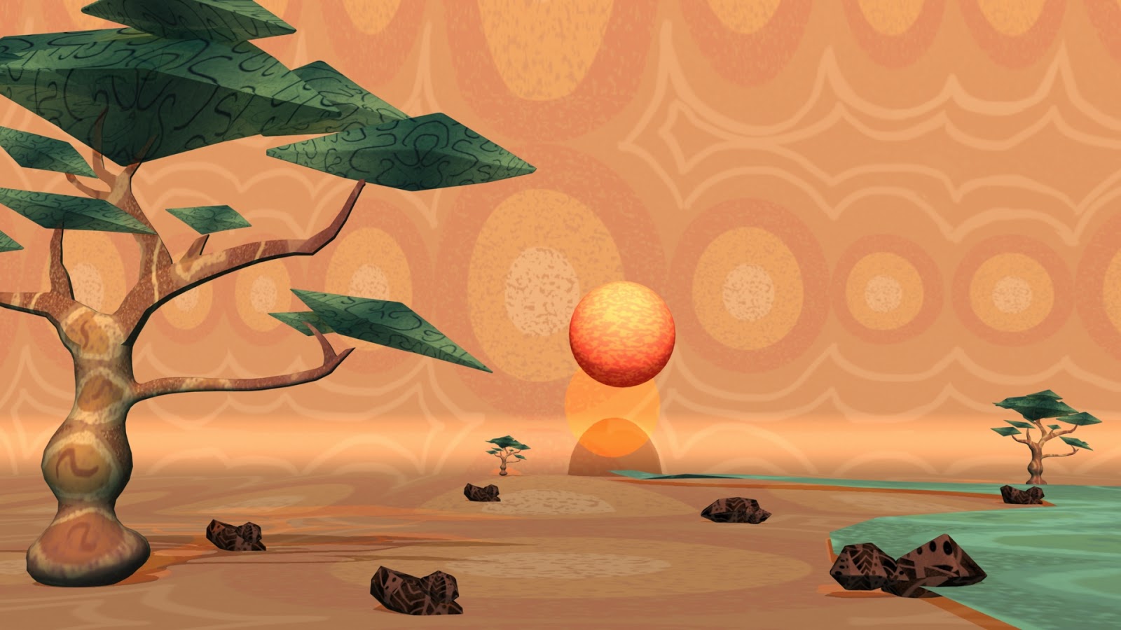
This is my texture and render progress over the weekend. I start from using contrast of orange and blue to stand out the objects and background, but it didn't make sense for a safari environment with the cave painting style we are going for, so I re-do the texture and the colour. Also safari should be a open space and wild environment so I scaled the background and move the sun more backward, gave more depth for the scene by adding trees at the background and extend the river.
Also darken the colour for the background to make it more like african cave painting.
To make it more realistic, I have model some rocks and textured them.
At this stage, I am not sure about the grass should appear like this because we want to create a scene with long grass around the whole environment, but it looks messy and lose focus of the scene and also if I do that it is going to take long time to render after putting our characters and animate them. So I am going to try another way to do the grass, which texture the plane with fur presets and attributes and make it in layers. I am going to do some tests before I put it in the scene.


Hi Candice :)
ReplyDeletePersonally - and I don't know how this effects your story - but I really like what is big and bold about the top image, though I don't like the sphere sun - it seems at odds with the other elements of your world - and I agree that the 'lots of grass' is working against the sense of this being a wide open plain. The top image reminds me very much of this scene from The Lion King - I like the artificiality and 'pop' of the tree against that decorative sky:
https://www.youtube.com/watch?v=ywjX6AF6oVc