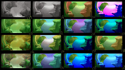
this is my development from thumbnail 122 from last post, and i am trying to create the river scene of painting and doing it further with composition and colours, thumbnail 128 was created while Rhys and Adam were giving me an idea of the waterfall could be reversed and compare with what i have done was interesting, in 122 i was trying to show audiences how should the river flows and how waterfall should be and 128 was more motional and it gains more on my perspective and depth as audience can see clearly by the river flowing to the same point and the sky be the background. and i have also done the colour coups with colour balance,hue and saturation.
thumbnail 128


they're all so beautiful! I love 131 and 134 the most though :)
ReplyDeletethank you :) and what do you think about 127?
DeleteHiya,
ReplyDeleteI really like 127/128, bold and natural colours. There's a unique style to your work that has a child-friendly approach.
127/132
ReplyDelete130, 131 and 133 do it for me :D the colours work really well together and don't seem to blend in with one another.
ReplyDelete