
continue my thumbnails sketching in process and i have done half and half with pencils and photoshop so i can keep my photoshop in practice and also did quick sketching for ideas. But don't really know what means good so still keep on sketching for experimental.
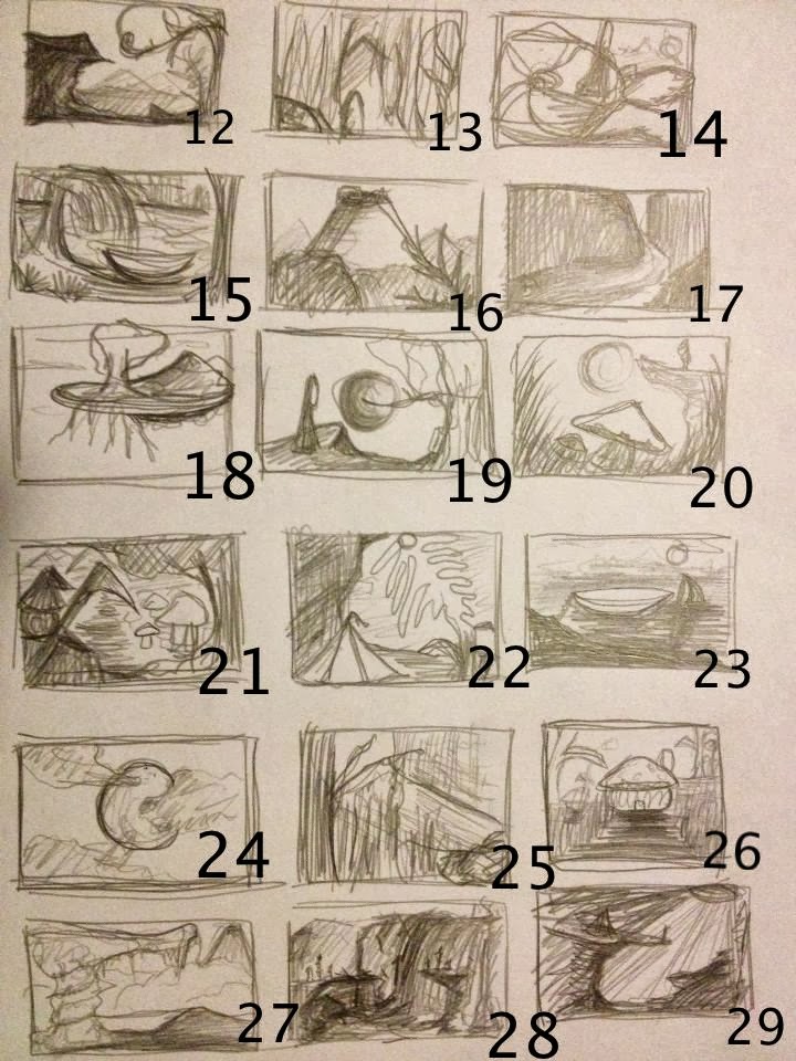
and i sketched the boxes below with photoshop, keep practicing my skills with different brushes. Some of them i zoomed really close and some of them i sketched as normal size. After i finished every single box, i found the bottom right group of boxes were connected with the black. It is interesting while that is not i expected to create new form of structure from mountains and trees.

I like thumbnails 29, 35 and 41. I think 29 is more picturesque with good composition, 35 just intrigues me as if its leaves or ivy trying to reclaim something or the screen were looking at. Finally 41 i like as you can play with light alot here, reflected light and shadows, will be interesting to see developments :)
ReplyDeletehi Rosalyn and thank you for commenting :) i think i should produce more and more and mix and match together :)
DeleteAlready going full steam ahead I see. The sketching is looking great and it's already providing so many possible areas of development. When painting in Photoshop, try playing around with harder brushes...some of the thumbnails above are looking a bit smooth and soft. This makes it difficult to read form and things become overly digital. The chalk brush and texture settings can make things feel a lot more natural and organic. Test them out and see how you find it. :)
ReplyDeletethank you for commenting :) and yea i think i should try on hard brushes as what you said ,but quite worried about the lighting and the perspective while i using hard brushes. should practices more :)
DeleteNumber 30, 42 and 44 have a good composition for some jaw dropping landscapes, while 41 has a very creepy nature, with the high contrast between the bright moon and dark trees setting the mood well. The composition for 39 has that creepy resonance but also a sense of grand scale and could be a real eye opener for your audience depending on how you wish to depict the tree, as its size and positioning makes it the focal point of the design and the deciding factor upon which emotion you wish your audience to feel :D Hope this helps!
ReplyDelete